Work that speaks for itself.
Take a look at a selection of my recent projects — each one a story of creativity, intention, and the kind of results that come from genuinely loving what you do.

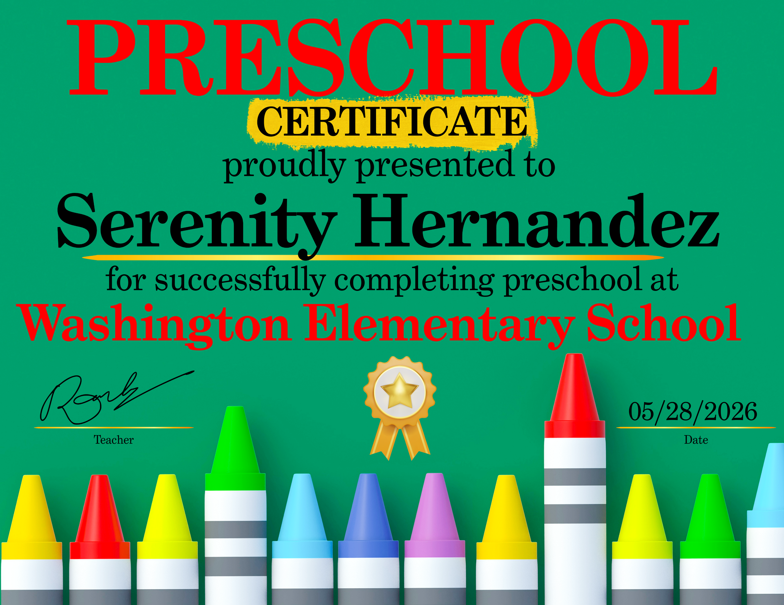
Inspired by my niece's big day — a celebration certificate proof that no milestone is too small to honor beautifully.
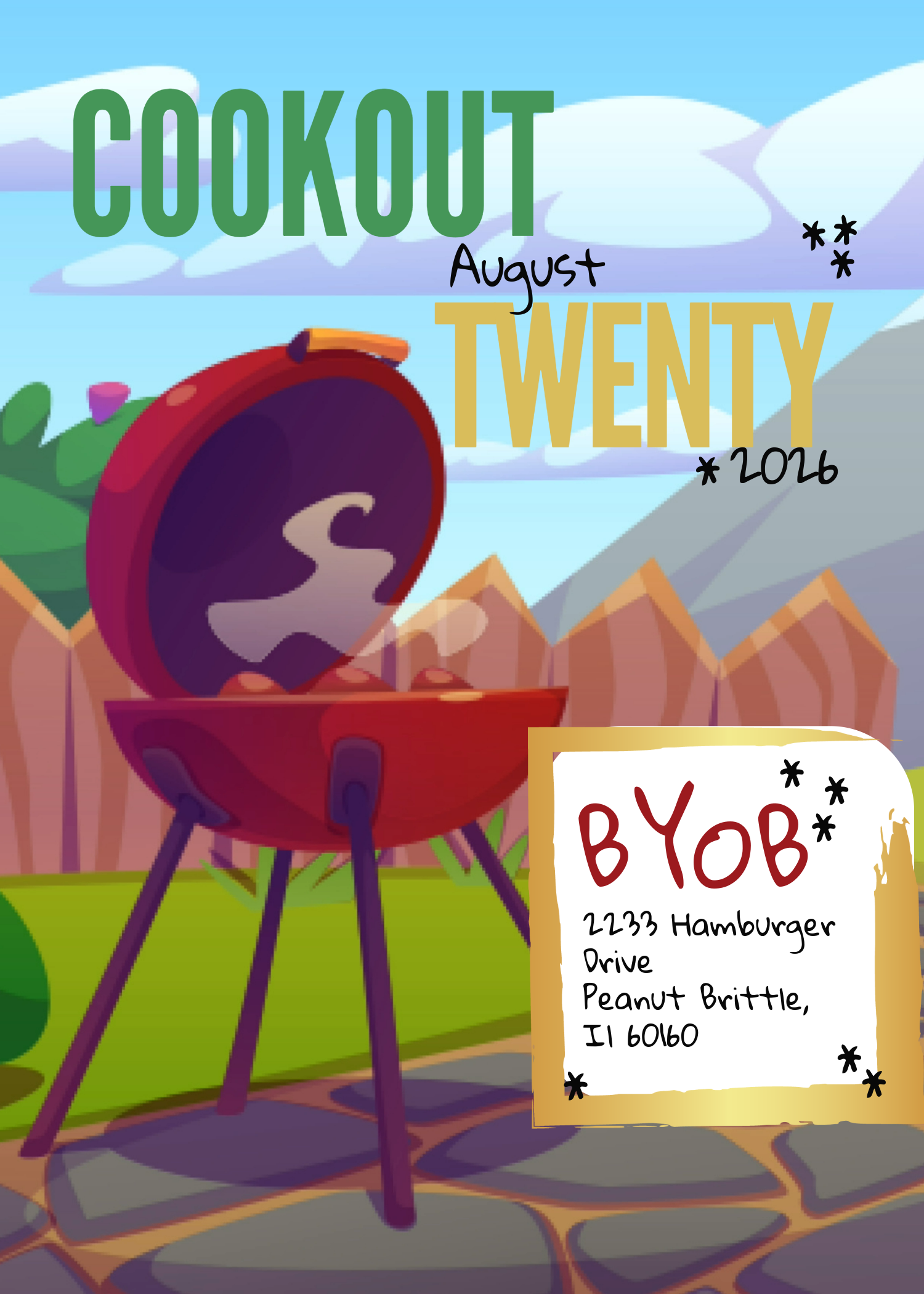
A summer cookout flyer built around bold type, bright color, and good vibes. Every design choice — from the playful mixed fonts to the worn notecard detail — was made to make you feel the heat before you even show up."
The final design was reached through an iterative drafting process, with each version testing a different creative direction:
Draft 1 — Core logo in isolation; evaluating composition, the split black/white concept, and typography.
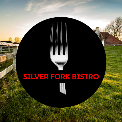
Draft 2 — Modern and minimal; photorealistic fork with bold all-caps type against a farm backdrop.
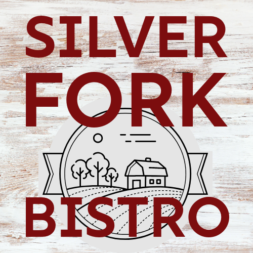
Draft 3 — Rustic and warm; distressed wood texture with a hand-drawn farmhouse emblem.
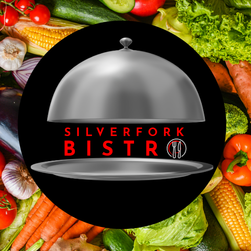
Draft 4 — Fine-dining focused; silver cloche symbol against a fresh produce background.
After weighing each direction against the brief, Draft 1 became the foundation — refined with a pastoral background to bring all elements together.
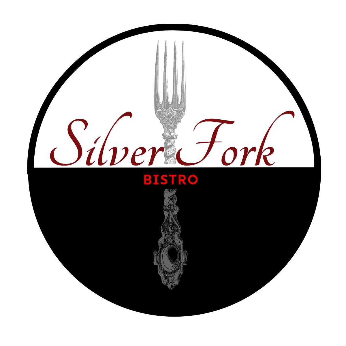
Final Design
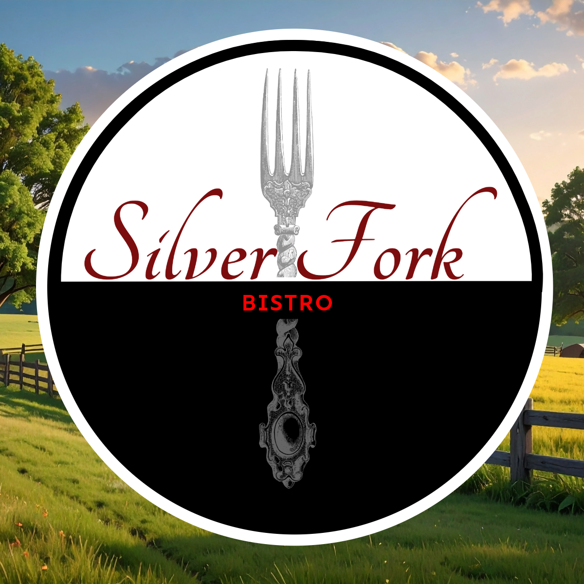
Designed a circular bistro logo for Silver Fork Bistro balancing upscale contemporary aesthetics with rustic warmth. The split black-and-white composition anchors a vintage engraved fork as the central culinary motif, complemented by deep crimson script typography and a farm landscape backdrop — communicating farm-to-table dining with refined, high-class appeal for a mature audience.
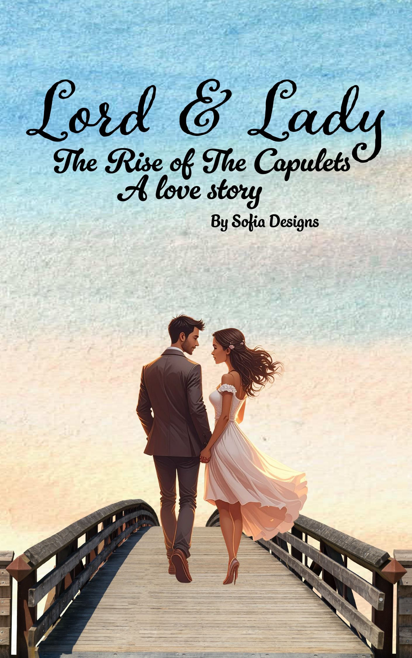
A Romeo & Juliet-inspired cover concept exploring the origins of the Capulet family. Designed to feel timeless, romantic, and full of the quiet power of a dynasty just beginning.